Fall culture guide
Landing page design and development. See live
Client
Crain's Chicago Business (website: ChicagoBusiness.com) is a business news site in metropolitan Chicago with 2.3 million+ average monthly page views. Crain's has a mainly affluent audience that earn $324,000 per year on average
Tools
Adobe Creative Suite, Bootstrap framework
Overview
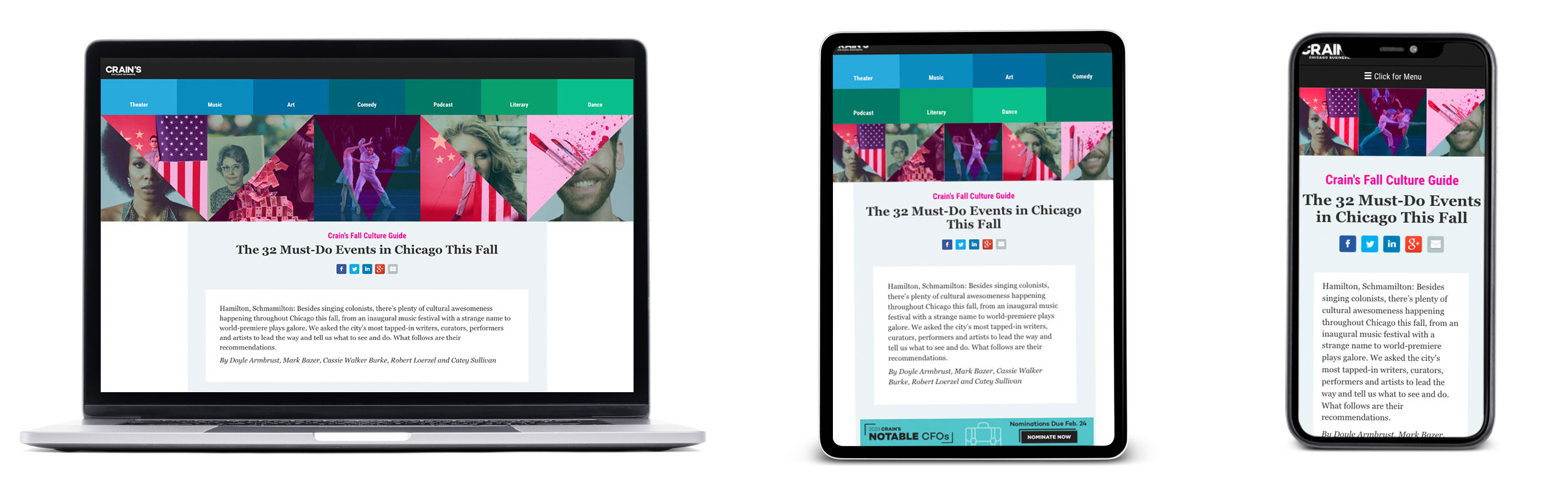
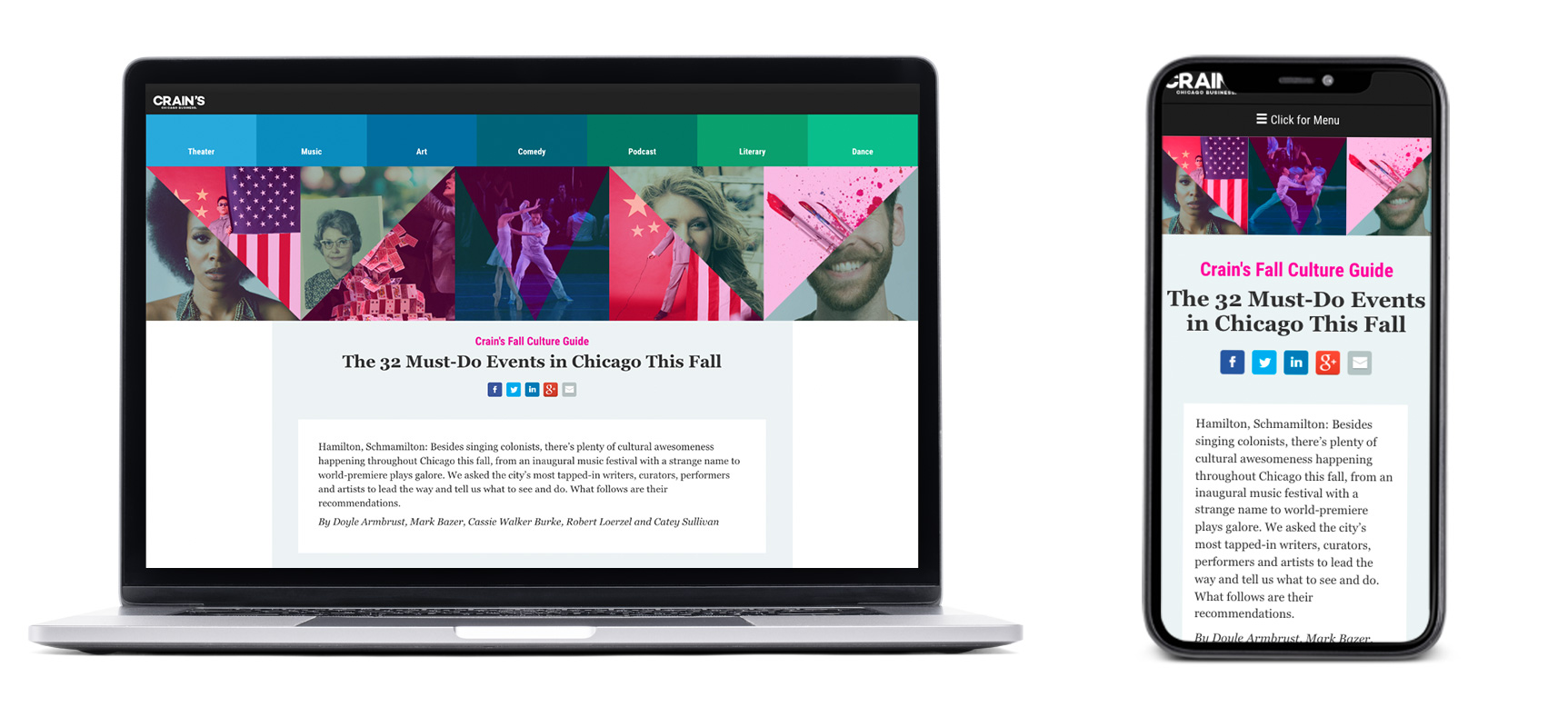
Every year Crain's Chicago Business publishes a (print + digital) culture guide showcasing Chicago events for the upcoming season. The goal here was to build a responsive, interactive and informational landing page that would pair well with the print version.
The editor wanted this to be an easy read with a visually appealing display that listed diverse events in the city. The page would reflect an overall essence of the events represented. The main audience for this page is affluent, well-educated, working professionals who tend to go out after work and on weekends.
Responsibilities
As the sole digital designer and lead front-end developer on this project, I led the charge to design and execute the entirety of this landing page. I worked with a team of editors, writers, print designer and developer to collaborate on strategy and content.
Process
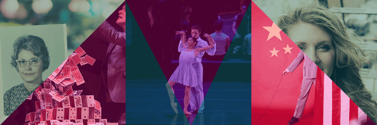
Together, the team and I collaborated and brainstormed on the concept of the guide agreeing that we wanted the overall look and feel to be fun, appealing and relevant - listing events that would cover a wide range of interest.
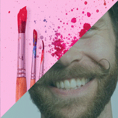
I was given creative freedom to design and build the guide as I saw fit based on the content and assets provided by the editors. My strength in color theory and love for geometric shapes played a helpful role in bringing the project to life cohesively. The editor decided on a numbered list to keep the readers interested, which was a great decision I was able to emphasize within the design.
Challenges
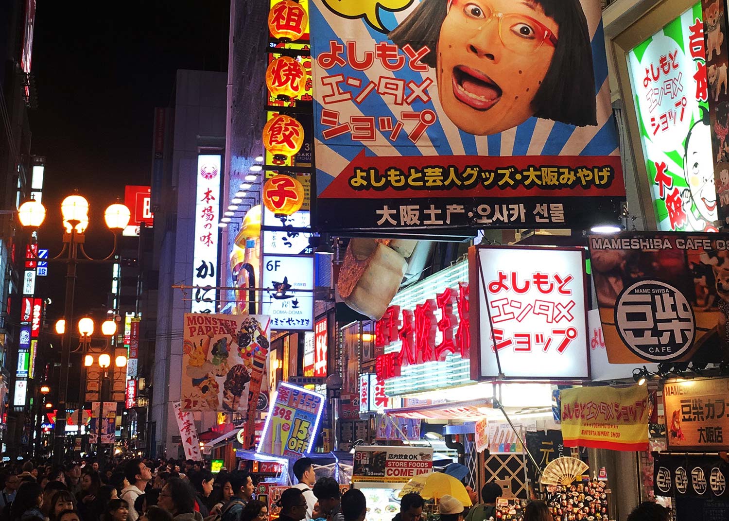
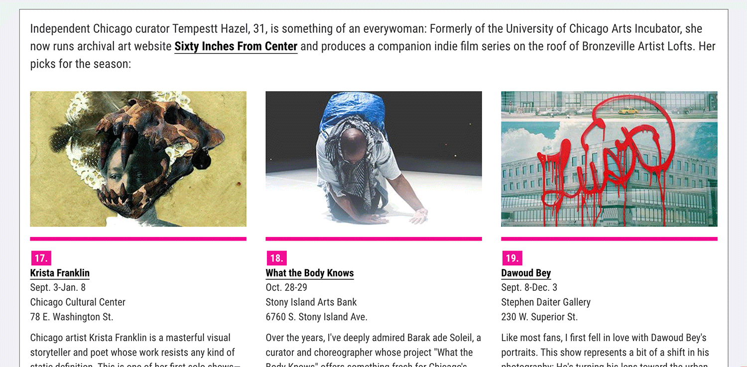
One of the main challenges of this project was the amount of content (32 events!) that would have to be displayed on one page while maintaining reader interest. Thus it was crucial to plan in a way that would make information scanning effortless. Like a busy street sign in Tokyo, good design will help users find what they want when they are looking for it. We'd have to implement a clear visual hierarchy that would allow for quick easy focus and maintain reader interest throughout the page. It would also be important that the reader be able to move around the page easily if they wanted to.
How to convey so much content without losing the reader?
Focus efforts on:
- Readability
- Maintaining interest
- Navigating around the page
Additional considerations: Build for all devices and make social sharing easy.
1. Readability. Make content scanning effortless
- Using color and shapes to point out numbered bullet points.
- Dividing the guide into content blocks for easy scanning.
- Use of imagery, color and font size differential for emphasis and attention
2. Maintaining interest. Keep readers scrolling for more
- Using visual hierarchy to prioritize popular events
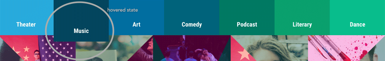
- Background color on hover state to provide user feedback
- Taking advantage of videos and other media files with celebrity visuals
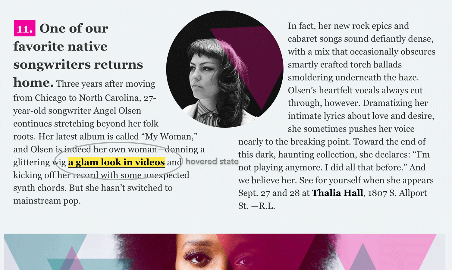
- Make it fun!
- Playing with geometry and complimentary colors help with consistency to bring the page together
- Finding interactive plug-ins that gave subtle yet fun interactions
- Creating gifs with movement for added interest
3. Navigating around the page. Make it easy for users to find content.
- Top navigation menu for a quick click to category of interest
- Adding a stationary "back to top" arrow on bottom right of page to allow for a simple and quick reach if the user desired to move back to the main navigation
What I would've done better
Provide ways for people to sign up for future guides to help readers stay ahead of new events and boost conversion rates.
It would have been good to provided reference links to other cultural/event stories.
On the back end, I would have implemented detailed tracking code to learn reader interest so we can create more focused stories for future publications.